
Spider-Man Noir: Should You Watch the Black and White or the Color?
Two Ways to Experience Spider-Noir
One of the most unique things about Spider-Noir is that two different visual presentations are offered to viewers. The series is available in both a classic black-and-white format and a full-color version, providing audiences with the chance to experience the story in very different ways.
The show is set in a dark alternate version of New York City in the 1930s and follows Ben Reilly, a former masked hero who has left his crime-fighting days behind him. Now a private eye after a personal tragedy. But a new, dangerous case forces him to confront the past he thought he had escaped.
Now that all eight episodes are out, many viewers are wondering which version is the better experience.
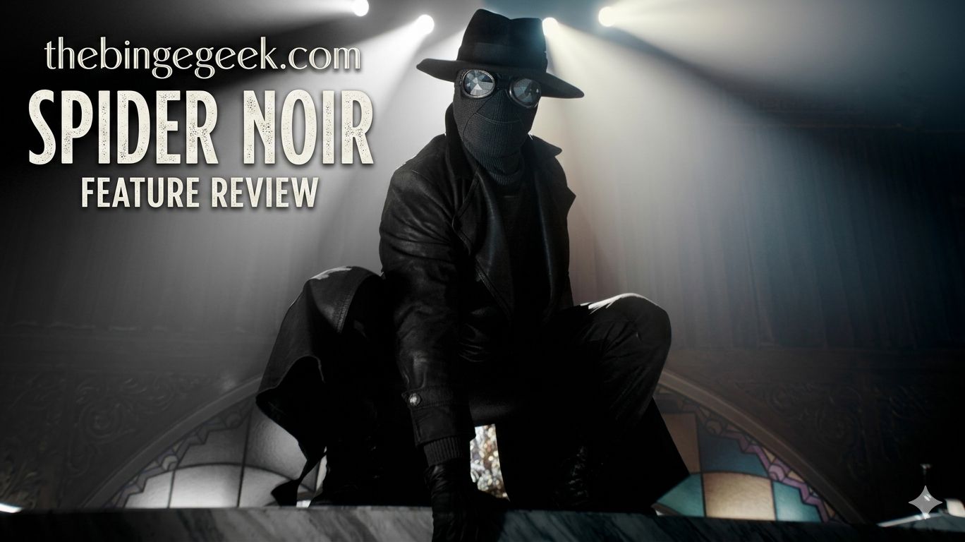
What is special about the black and white version
Its black-and-white presentation is a love letter to classic noir cinema. Every frame is staged to simulate the feel of old detective movies, with dramatic shadows, smoky interiors and stark contrasts of light and dark.
This format really adds to the mood of the show. The lack of color forces the viewer to concentrate on the characters, their emotions and the tension of each scene. The visual storytelling is tighter and has more of a sense of mystery and suspense.
It works for a lot of the show’s most memorable imagery. Monochrome intensifies the drama of poorly lit streets, shadowed faces, flickering flames and rain-slicked cityscapes. The cinematography is really something and makes every scene seem so well thought out.
The black and white version doesn’t make it feel dated, but rather gives it a timeless quality that matches its detective-story roots.
What the Color Version Has to Offer
The full color version is another story altogether. It’s not trying to be realistic, but rather colorful and very saturated imagery, while still keeping the period setting.
The costume designs are easier to see, allowing the audience to see the bright colors and details of the clothing. Characters are more distinct and locations more lively and stylish.
There are some places that seem more alive in color, like bars, nightclubs, and city streets. The production design gets more of a workout, as every color and texture is in clear view on screen.
The brighter palette, however, can also sap some of the tension on which the noir genre traditionally trades. Mysterious and imposing black and white, sometimes less dramatic in colours.
The bright presentation may also compete with the content for some viewers, making the screen busier than you want it to be.
Which one should you choose?
Both have their merits, and it depends on what you are after.
Those interested in the costume work and production design, and the bright visual details, would be well served with the full-color version. It celebrates the art that went into the show’s sets and wardrobes, but also presents it in a stylish, modern way.
If, on the other hand, you want the most immersive noir experience, then the black and white version is the clear winner. It captures the spirit of classic detective movies, thickening the atmosphere and elevating the show’s cinematography in a way that feels true to its genre.
Final Judgement
The color version looks great, but the black and white version is the better overall experience. The monochrome visuals add to the mood, add to the storytelling and make Spider-Noir seem like a genuine noir drama, not just a superhero series set years ago.
If you’re a first-time viewer of the show, then the black and white version is the way to go to experience Spider-Noir.